“Create a VHS tape for a film that was released after 2005. Try and make it look like an 80s era tape like the example provided. Good luck, and may the 80s be with you always!”
“Relive the classic days of Nintendo with The Super Mario Bros. Movie: Retro Edition! Includes a nostalgic disc cover and a free copy of Super Mario Bros. for the Nintendo Entertainment System*. Now you’re playing with power: Nintendo Power!”
*Nintendo Entertainment System not included
This collector’s edition of The Super Mario Bros. Movie, made in collaboration between Nintendo and Illumination Studios, takes a new twist (or old, in this case) by referencing the very first showdown between Mario and Bowser. The cover mimics the original cover for Super Mario Bros. and comes with a free copy of the very game it’s based on. What gets more 80’s than that? Don’t worry, though, the movie itself is as high-definition as ever!
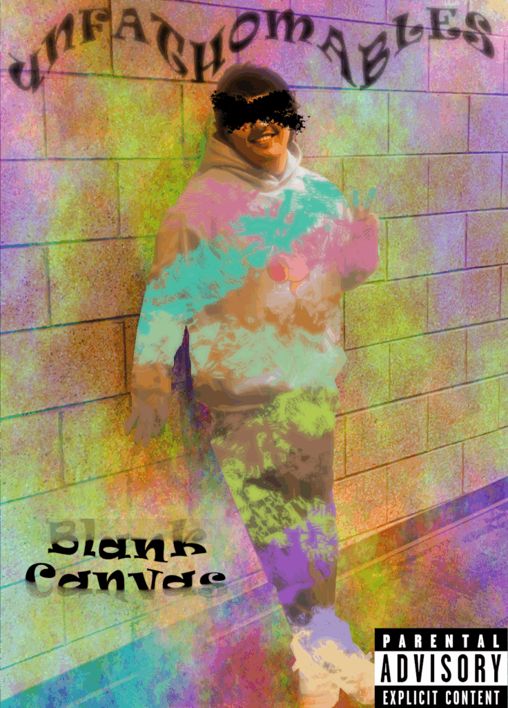
“First, take some photos of friends, family, yourself, your dog, or anyone that strikes your fancy! Then, turn it into some rad Album art! Experiment with filters, add shapes and colors, and think about how you can create a design out of your photos.”
Your definition of you is something that you can decide, and you should feel free to grow that you into fruition. Unfathomables is a queer jazz rock band that seeks to encourage those who feel they want a new coat of paint. Come see us perform as [[REDACTED]] and let your true self break free for just a night.
I have many emotional connections to the trans and genderqueer communities, and want to help others feel comfortable in learning who or what they are. As such, I’ve formed this band to build support and awareness*. Our music explores themes of identity, and the connection between one’s body and soul. Many of our songs use vulgar or otherwise non-child friendly language, so most events are 13+.
*Unfathomables, my band, does not actually exist. However, I do associate with the trans and genderqueer communities as someone currently questioning their gender identity. As such, if you are actually interested in this kind of music, there are multiple queer bands out there for one to enjoy, with examples such as Ma Rainey and Esperanza Spaulding.
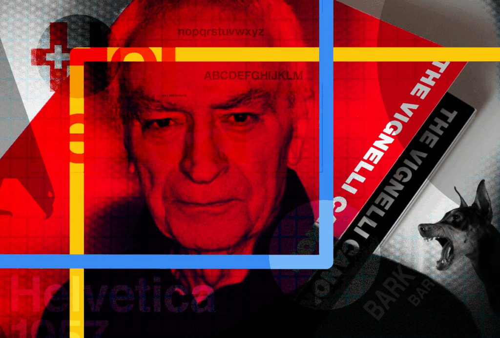
I learned quite a bit about the intangible aspects of design from Vignelli, which were ideas that I was never really taught in my art classes over the years. I’ve always understood most or all the tangible aspects, such as material, color, texture, form, all of that, but the ideas of timelessness, semantics, or the like were foreign from me.
What was easier or harder?
I found the Design Blitz quite easy, since I was able to go somewhere with plenty of material to use in the National Zoo. Sometimes the best designs are created by nature as opposed to man. As for what was harder, the VHS assignment was quite difficult for me to get down since I was never super big on the aesthetics of the time, but it was fun regardless.
How can I improve?
Firstly, practice. I know that’s a bit of a cop out answer, but there’s no other answer as correct as just continuously doing this type of thing until I perfect my craft. If you want more specifics, though, honing in on those intangibles and improving my resistance to the temptations of procrastination are what I need to work on. I want to make my art better, and I want to be able to do it without stressing myself out a ton about an imminent deadline.
For this assignment, I was tasked with taking a series of photos that could reasonably represent certain aspects of design. However, I didn’t want to be boring and browse my room or house again. Thankfully, I got a wonderful opportunity over the week with my family going to the Smithsonian National Zoo. As such, all of my photos were taken during that trip.
Rhythm:
First, I went to the Amazonia exhibits, as I am personally fascinated by all the flora and fauna of the Amazon rainforest. Here, I found this Bigtooth river stingray, and felt that it was perfect for representing rhythm. The matte black body with the tons of yellow dots across its body, all imperfect and asymmetrical yet almost feeling like a consistent pattern sells the idea of this creature being smooth and simple, yet dangerous to handle. To me, it invokes the imagery of a messy yet beautiful starry night.
Typography:
I saw this sign made to allow people to donate money to protecting the pandas at the zoo and across the world, and since they are my absolute favorite animal, I had to do so. Unfortunately, the sign wasn’t working, but I did feel that I could still use it for this assignment. I feel that it is a great example of simple yet clean and effective typography. The font is nice and doesn’t try to overstylize at the cost of readability, and all the most important words are highlighted by not only their size, but also the design of the sign itself. Mix that with good graphic design and it shows itself to be a great example of why more is not always better with typography.
Color:
I saw this overgrown fence close to where all the birds were being kept, and I felt that it was a really nice way to display the important of color. Obviously, there’s the point that so much of it is defined by green, to the point where if you smudged this whole image into one color, it’d likely be a clear shade of green. Alongside that, though, there’s also a bit of contrast with the light browns of the soil which the thin bamboos were growing from, the black of the fencing, and the the smallest sprinkles of a dark brown from the trees in the background. It’s important to choose one color or color scheme to define the piece, but sometimes it’s important to break that up with a bit of something different so it doesn’t become blurred and confusing.
Dominance:
And of course, I had to go with this photo for the concept of dominance. Even with an entire half of the photo above being vegetation, I would bet that your eye immediately went to one of the scarlet ibises, particularly the one standing right in the shade. That, I feel, is what defines dominance: when something can be such a small part of a photo yet instantly grab your attention. The framing of it being in the middle of the frame, the rock and stump surrounding it, the shade (ironically enough) highlighting its presence in relation to the others, this small bird manages to use everything around it to steal the spotlight.
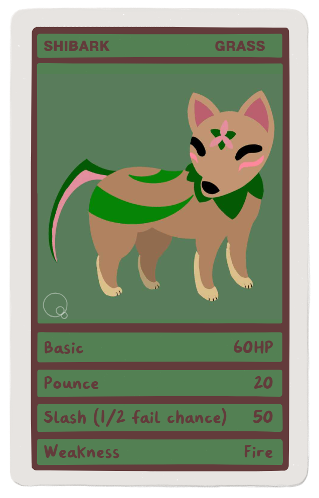
“Immortalize your character on a trading card! You know you want to. Use the Visual Thinkery Trading Card Remixer (https://remixer.visualthinkery.com/r/1YgU14YCP4e7puXTdMxS), add an image, customize the colors and change the text as necessary.”
Shibark, a creature created by me, paired on a card meant to mimic the stats on a Pokemon TCG card.
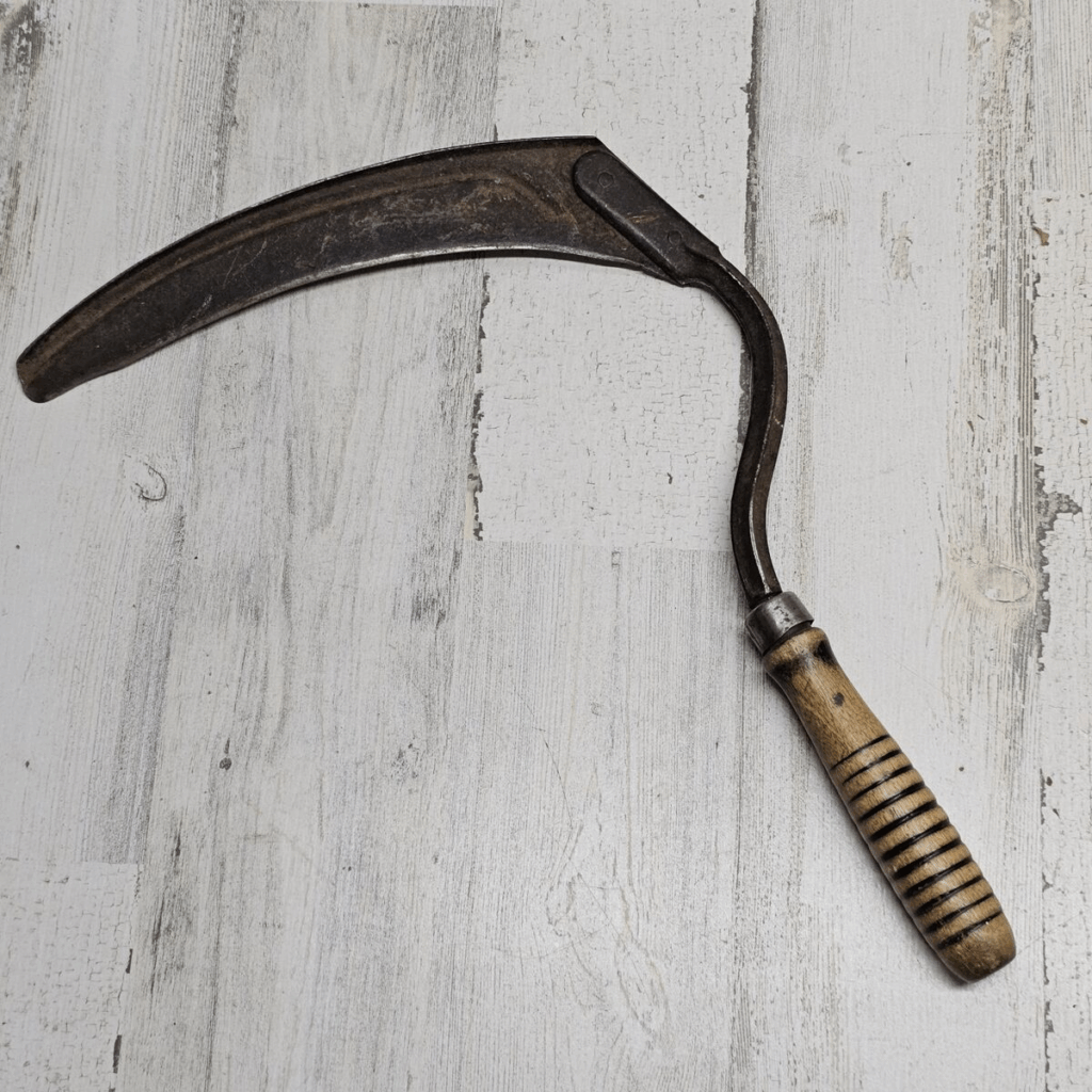
Shibark are curious nature spirits that take the form of a fox when encountering humans. Many farmers leave offerings out for them in times of famine in hopes of bringing stronger crops. In truth, while their presence does bring a minor boost in vitality to nearby plants, it’s rarely enough to greatly impact a damaged harvest. It was once commonly believed that ancient humans took inspiration from Shibark’s tail when designing the first farming scythes. However, new historical records appear to indicate that this is not the case, and that the similar shapes are pure coincidence.
Shibark tend to be quite friendly with others, including most humans. However, they are also quite spiteful, and if they feel that someone has harmed the environment around them, or if they deem their offerings inadequate, they will single out something belonging to that individual and either steal or destroy it. Because of this, areas frequented by Shibark often develop cultures focused on conservation and spiritual practices.
As the world urbanizes and becomes less and less intertwined with nature, Shibark have become quite an uncommon encounter in most places around the world. As such, many cities and suburbs have lost their traditions of providing offerings and sanctity to these spirits, and thus vandalisms caused by them become more frequent. Nowadays, many places consider them to be pests despite their usually kind demeanor.
Shibark is a design that I personally made two years ago, and just recently redesigned to be more cute and well-drawn. I originally made them as my first ever fan-made Pokémon, and now intend to use them as one of the first partners in the eventual game that I plan to make in the far future. The name is a combination of Shiba Inu and Bark (both the dog kind of bark and tree kind of bark), and it’s meant to look like it’s inspired by Japanese mythology, as well as the game Okami and its playable character Amaterasu. Their eyes are meant to mimic the thin eyes on your traditional Japanese fox mask, and while I can’t show it off incredibly in the photo, those markings on its body are intended to lightly glow when under stress. I hope that this design serves this assignment well and is something that can be appreciated, as it’s one of the designs that I’m most proud of making.
Firstly, I will say that I do agree fully with his principles. Ideas such as the timelessness of a design or its ambiguity, are ones that I haven’t really thought of a whole lot with most of my art. Of course, I try my absolute hardest to put effort and care into what I make, but I haven’t ever really considered the semantics or the pragmatics of it. As for the tangible ideas, such as the fundamentals of art (color, texture, etc.) and the paper you use, I do understand and utilize them. Overall, I think that this book has a very good grasp of the standard and well-understood aspects of design, as well as the more complex aspects of it that most don’t think about.
I will be honest, though, when I read through this the first time, some of the language used by Vignelli felt a little… abrasive? Gatekeeping-adjacent, for a lack of a more professional term? I don’t know, it really felt like to me that he was stating that if a design doesn’t utilize all the tangible and intangible aspects of design, it is lesser art and is “polluting” the artistic world. Now that I read it more, though, I recognize that it was not his intent, and that when he talks about less well-made art pieces being “they are either meaningless or incredibly vulgar or criminal when done on purpose”, he means those who make intentionally poor art and tries to pass them as professional masterpieces.
Either way, that’s what I thought of this book. It’s a great reference point for both basic and complex design ideas, and while sometimes harshly worded, I quite agree with its viewpoints on artwork which intentionally lies about its quality.