Welcome to my personal void

No one knows what goes on here, least of all me

Category: Assignments

  • Week 2 Daily Creates

    For the second week of Daily Creates, I completed the objectives from May 26th, May 29th, and June 1st. Here are the following creates:

    May 26th: Dark Side of the ds106 Moon #tdc4882

    What mystery of ds106 lies on the side of the moon outside of our view? Show us in art.
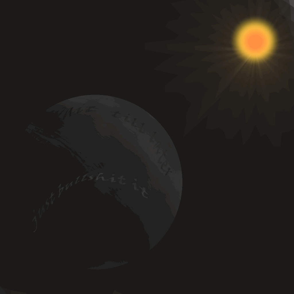
    A lot of times, it can be a bit of a struggle for me to find the motivation to get this work done, especially when I’m working from home. Naturally, since that leads to me putting things off till the last minute, it means that I frequently will end up just making stuff up to get the grades. I am aware it’s a habit that is important for me to break, not only for this class, but for any other, and I do my absolute best to avoid that situation, but the dark side of my moon is hard to keep hidden sometimes.

    May 29th: Unparalleled Misalignments For Today’s Diurnal Concoction #tdc4885

    Unparalleled Misalignments are “pairs of non-synonymous phrases where the words in one phrase are each synonyms of the words in the other.” Create one and then use it in authoritative message.

    Fool’s Gold // Con’s Coin

    Avoid the Con’s Coin, lest it make you believe in value that isn’t there.

    I wanted to play off of the phrase “Fool’s Gold”, which is actually iron sulfide but looks incredibly similar to gold. As such, I turned the idea of the fool from the person being deceived to the one doing the deceiving, or if it’s simpler, the action of a Con being that of trickery and deceit. Then I took the meaning of gold from being the metal to being the currency, and turned it into a Coin. Therefore, the Con’s Coin.

    June 1st: Dinosaur Day #tdc4888

    June 1st is Dinosaur Day! If you were a DS106 dinosaur, what would you look like? Would you be a giant scary one or small cute cuddly one?
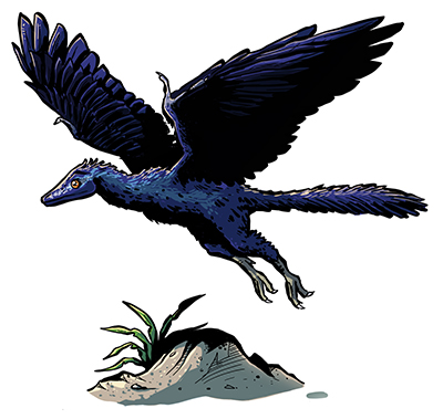
    – Photo credit: National History Museum

    Unfortunately, I don’t have a self-made drawing of one, but I’ve always imagined myself as an Archaeopteryx. I commonly relate to birds, both because of a nickname and because I love their sense of freedom, and this is basically the original bird. Plus, I’m not exactly the strongest or largest, but I’d say I’m a pretty nimble and quick individual, just like this dino.

  • Intro to Design Part III: Design Blitz

    For this assignment, I was tasked with taking a series of photos that could reasonably represent certain aspects of design. However, I didn’t want to be boring and browse my room or house again. Thankfully, I got a wonderful opportunity over the week with my family going to the Smithsonian National Zoo. As such, all of my photos were taken during that trip.

    Rhythm:

    IMG_9590

    First, I went to the Amazonia exhibits, as I am personally fascinated by all the flora and fauna of the Amazon rainforest. Here, I found this Bigtooth river stingray, and felt that it was perfect for representing rhythm. The matte black body with the tons of yellow dots across its body, all imperfect and asymmetrical yet almost feeling like a consistent pattern sells the idea of this creature being smooth and simple, yet dangerous to handle. To me, it invokes the imagery of a messy yet beautiful starry night.

    Typography:

    IMG_9583

    I saw this sign made to allow people to donate money to protecting the pandas at the zoo and across the world, and since they are my absolute favorite animal, I had to do so. Unfortunately, the sign wasn’t working, but I did feel that I could still use it for this assignment. I feel that it is a great example of simple yet clean and effective typography. The font is nice and doesn’t try to overstylize at the cost of readability, and all the most important words are highlighted by not only their size, but also the design of the sign itself. Mix that with good graphic design and it shows itself to be a great example of why more is not always better with typography.

    Color:

    IMG_9566

    I saw this overgrown fence close to where all the birds were being kept, and I felt that it was a really nice way to display the important of color. Obviously, there’s the point that so much of it is defined by green, to the point where if you smudged this whole image into one color, it’d likely be a clear shade of green. Alongside that, though, there’s also a bit of contrast with the light browns of the soil which the thin bamboos were growing from, the black of the fencing, and the the smallest sprinkles of a dark brown from the trees in the background. It’s important to choose one color or color scheme to define the piece, but sometimes it’s important to break that up with a bit of something different so it doesn’t become blurred and confusing.

    Dominance:

    IMG_9564

    And of course, I had to go with this photo for the concept of dominance. Even with an entire half of the photo above being vegetation, I would bet that your eye immediately went to one of the scarlet ibises, particularly the one standing right in the shade. That, I feel, is what defines dominance: when something can be such a small part of a photo yet instantly grab your attention. The framing of it being in the middle of the frame, the rock and stump surrounding it, the shade (ironically enough) highlighting its presence in relation to the others, this small bird manages to use everything around it to steal the spotlight.

  • Intro to Design Part IV-1: Personal Trading Card

    https://assignments.ds106.us/assignments/personal-trading-card/

    “Immortalize your character on a trading card! You know you want to. Use the Visual Thinkery Trading Card Remixer (https://remixer.visualthinkery.com/r/1YgU14YCP4e7puXTdMxS), add an image, customize the colors and change the text as necessary.”

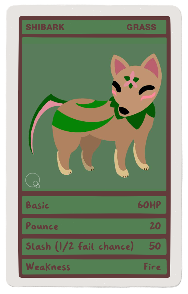
    Shibark, a creature created by me, paired on a card meant to mimic the stats on a Pokemon TCG card.

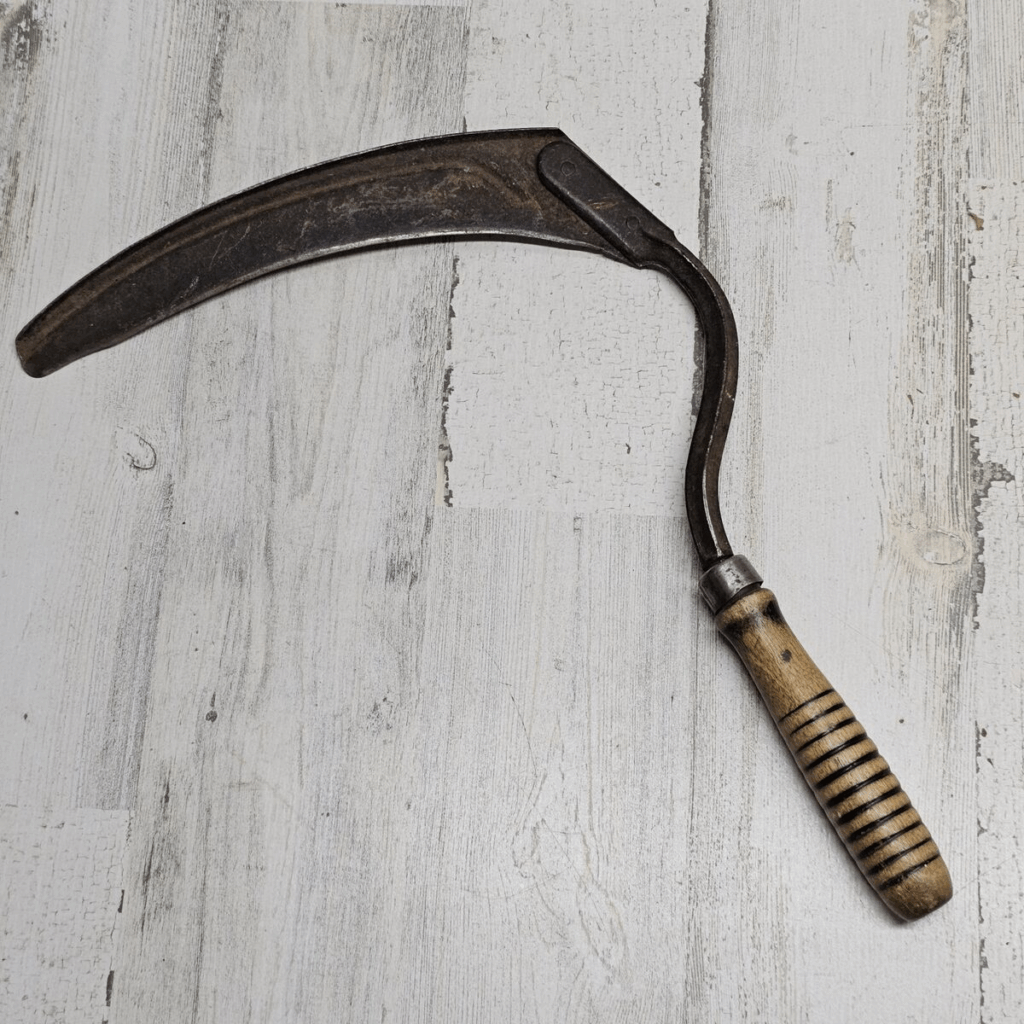
    Shibark are curious nature spirits that take the form of a fox when encountering humans. Many farmers leave offerings out for them in times of famine in hopes of bringing stronger crops. In truth, while their presence does bring a minor boost in vitality to nearby plants, it’s rarely enough to greatly impact a damaged harvest. It was once commonly believed that ancient humans took inspiration from Shibark’s tail when designing the first farming scythes. However, new historical records appear to indicate that this is not the case, and that the similar shapes are pure coincidence.

    Shibark tend to be quite friendly with others, including most humans. However, they are also quite spiteful, and if they feel that someone has harmed the environment around them, or if they deem their offerings inadequate, they will single out something belonging to that individual and either steal or destroy it. Because of this, areas frequented by Shibark often develop cultures focused on conservation and spiritual practices.

    As the world urbanizes and becomes less and less intertwined with nature, Shibark have become quite an uncommon encounter in most places around the world. As such, many cities and suburbs have lost their traditions of providing offerings and sanctity to these spirits, and thus vandalisms caused by them become more frequent. Nowadays, many places consider them to be pests despite their usually kind demeanor.

    Shibark is a design that I personally made two years ago, and just recently redesigned to be more cute and well-drawn. I originally made them as my first ever fan-made Pokémon, and now intend to use them as one of the first partners in the eventual game that I plan to make in the far future. The name is a combination of Shiba Inu and Bark (both the dog kind of bark and tree kind of bark), and it’s meant to look like it’s inspired by Japanese mythology, as well as the game Okami and its playable character Amaterasu. Their eyes are meant to mimic the thin eyes on your traditional Japanese fox mask, and while I can’t show it off incredibly in the photo, those markings on its body are intended to lightly glow when under stress. I hope that this design serves this assignment well and is something that can be appreciated, as it’s one of the designs that I’m most proud of making.

  • Intro to Design Part II: The Vignelli Canon

    Photo credit to UX Collective

    Firstly, I will say that I do agree fully with his principles. Ideas such as the timelessness of a design or its ambiguity, are ones that I haven’t really thought of a whole lot with most of my art. Of course, I try my absolute hardest to put effort and care into what I make, but I haven’t ever really considered the semantics or the pragmatics of it. As for the tangible ideas, such as the fundamentals of art (color, texture, etc.) and the paper you use, I do understand and utilize them. Overall, I think that this book has a very good grasp of the standard and well-understood aspects of design, as well as the more complex aspects of it that most don’t think about.

    I will be honest, though, when I read through this the first time, some of the language used by Vignelli felt a little… abrasive? Gatekeeping-adjacent, for a lack of a more professional term? I don’t know, it really felt like to me that he was stating that if a design doesn’t utilize all the tangible and intangible aspects of design, it is lesser art and is “polluting” the artistic world. Now that I read it more, though, I recognize that it was not his intent, and that when he talks about less well-made art pieces being “they are either meaningless or incredibly vulgar or criminal when done on purpose”, he means those who make intentionally poor art and tries to pass them as professional masterpieces.

    Either way, that’s what I thought of this book. It’s a great reference point for both basic and complex design ideas, and while sometimes harshly worded, I quite agree with its viewpoints on artwork which intentionally lies about its quality.

  • Intro Visual Part IV: Summary

    Part I

    Part II

    Part III:
    Assignment 1: City Graphic Poster
    Assignment 2: Favorite Photo
    Assignment 3: Magic of Nature
    Assignment 4: Draw-It

    What Did I Learn?

    First of all, I learned that I severely underestimated the amount of time this would end up taking, and will be improving upon that. But as for what I learned about actual storytelling, I found that I greatly enjoy making quick doodles for this kind of thing, much more than I already knew. I expected me to not like having to repeatedly make a bunch of photos for these assignments, and I don’t think I have enough skill to really make it into a career or anything, but I had a lot of fun working on these assignments and the Daily Creates.

    What was easier or harder?

    The Magic of Nature (called the “Earth” assignment on the the Visual Assignment website) was a lot simpler than I was anticipating from a 5-star challenge, as it was really just making the words, adding a bit of flair in the background, then imposing a lot of nature-like brushes on top of the words. The Draw-It, however, was a lot more complicated, as I had no idea which photo I wanted to do and knew I needed to find one that had a good story to it. I eventually found one and like how it turned out, but I was expecting a 2-star to be a lot simpler.

    How can I improve?

    Well, other than give myself more time to do these, I don’t want to make this assignment late again in the future. I could definitely improve my storytelling skills, as while the Draw-It story wasn’t terrible, it was very basic and didn’t give much in-depth descriptions of anything. It’s a skill I really need to hone for the things I want to do in the future.

    As for improving my blog itself, I need to learn how to actually customize and optimize my site, as right now it’s a bit of a mess. It’s functional enough for the class, but I would like to make it better. Once I do that, future assignments will be much easier to navigate and create.

  • Intro Visual Part III-4: World Pup (Draw-It)

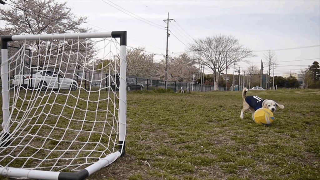
    “Take a photograph of something (If you take a picture from the internet, make sure to be nice and cite the original) and transform it through GIMP, Photoshop, etc, into a drawing.”

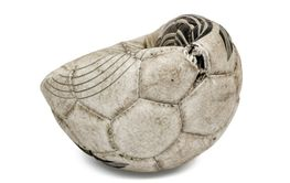
    One day, there was a corgi, and with her was her trusted ball. Now this dog was not the brightest or the most graceful, but she had a dream. This dream was to one day win the World Pup, the ultimate test of talent for any soccer-loving canine around the world. So every day and every night, this pup trained her hardest to become the best soccer dog ever. Her bounds went from clumsy to calculated, and she scored goal after goal after goal. Every single move she made, she made with her favorite soccer ball.

    Finally, she felt ready. She convinced her owners to take her to the World Pup, and got prepared to team up with her fellow corgis to take home the trophy. They won the first round, and then the second, and found themselves squaring up against the Australian Shepherds. They played their hearts out, and were evened up with the much larger dogs until tragedy struck. Our corgi’s favorite ball, in the heat of the game, tore upon and got destroyed!

    She was absolutely devastated, and while she still tried to play, it just simply wasn’t the same, and in the end, they just barely lost. Her ball was gone and she didn’t make it to the top. She went home in a slump, and thought she would never play again. However, when she woke up the next day, she saw a miracle: her owners has taken home her ball and put it back together, good as new! Our corgi friend realized then that she didn’t care about being the best, or for winning the World Pup. All she cared about was that she had her favorite ball back.

    My Dog and Her Ball

    This has been my story, based on my own beloved corgi Maggie. Her favorite toy is her fake soccer ball, and we often make jokes about her joining the World Pup, so I decided to roll with this and spin it into a story of attachment, heartache, and most importantly, a very, very good dog.

  • Intro Visual Part III-3: Magic of Nature

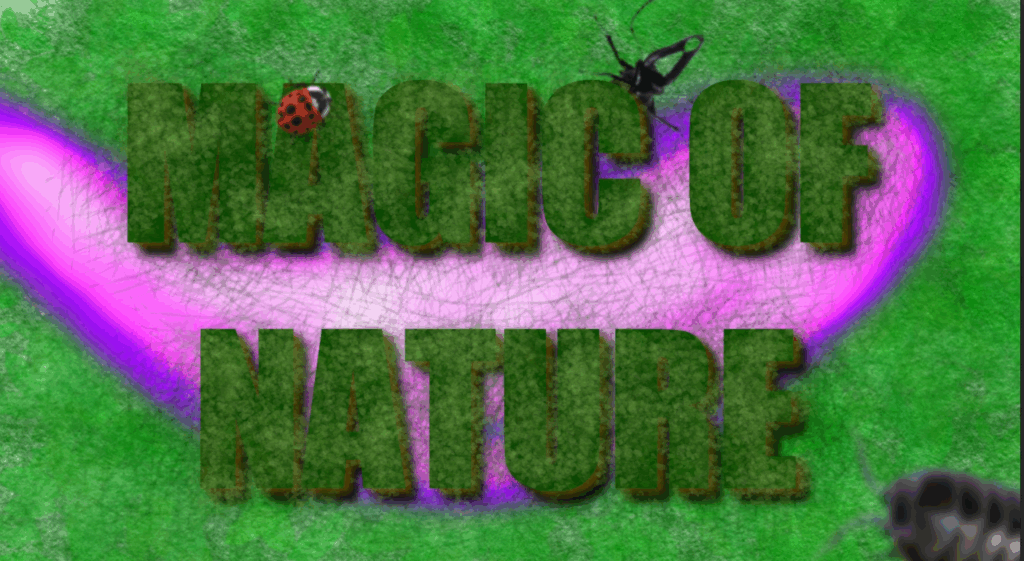
    I saw one about creating some nature-themed text, and I decided that I wanted to take my hand at that with a little sorcerous flair to it. One, I just like magic and think it improves the contrast of the photo to have a magic missile soaring through, but two, there are so many things in nature explained as science that I refuse to believe isn’t just magic we somehow understand. Like, what do you mean worms can just duplicate when cut apart? That’s straight magic and I refuse to hear anything else.

  • Intro Visual Part III-2: Favorite Photo

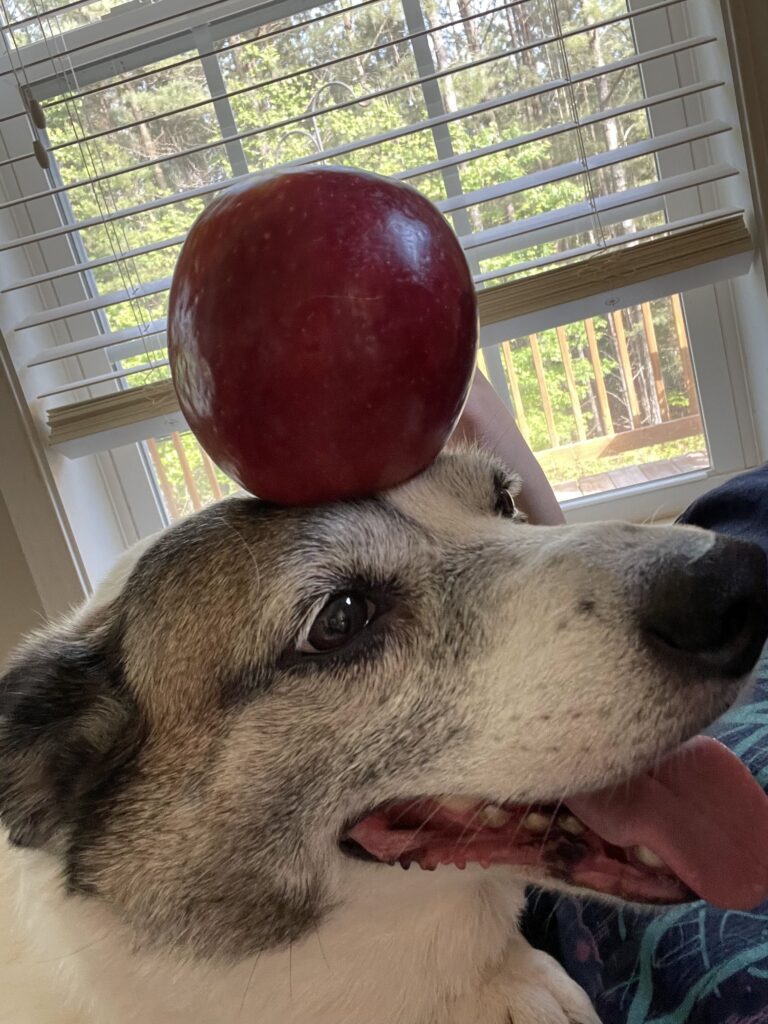
    I’ll admit, there’s not really much deep reason as to why I chose this as my favorite photo I’ve personally taken. For one, it’s probably one of the higher quality photos I’ve taken, but more importantly to me, it’s of my dog Maggie that I’ve had for years at this point. I rescued her from a shelter before I moved here and she’s been one of the most important faces in my life since, and I can’t imagine myself without her.

    The apple on the head just adds to her overall silly nature, she is a complete brat and goofball and I wouldn’t change a thing about her.

  • Intro Visual Part III-1: City Graphic Poster

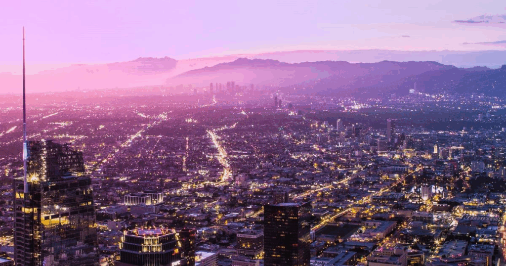
    I decided to make a horizontal banner-style poster as opposed to a portrait-style one for this assignment. I ended up deciding on San Antonio, as while I’m not from there specifically, I grew up in Texas and loves our visits to the city. The food there was awesome, the Alamo was a nice place, and the canoe rides were fantastic, so I have fond memories of there.

    I mainly used GIMP for this assignment, as that’s the primary photo editing software that I use. I use the Oilify artistic filter to make it look like, well, an oil painting, then replaced the background with almost a sunset gradient. Finally, I put in the location’s text in the back with it being partially behind the city’s horizon. There’s not much more to say, it’s not a very complex image.

  • Intro Visual Part I: Read and Reflect

    I’ll start this reflection by clarifying that I have no idea what I’m doing with photography, nor is it a primary skill that I feel inclined to hone over months or years. I am focused more on artistical styles based around drawing or painting than this, although I will do my best to improve for the sake of this class.

    But anyway, that’s unimportant. My main point is what I understood about the readings and techniques discussed for this assignment.

    To start with, the main points that I immediately got were ones more focused on one’s equipment, as you can’t really argue about improved gear leading to improved outputs. Topics such as using the best lens for your intended target, exposing your images through things like shutter speed, and more make sense as to why they help. I don’t quite have a camera to actually experiment these tactics with other than my phone, so I unfortunately will not be capable of applying these practices to my photography, but it will still be something I try to keep in mind.

    Other points that I know will be a little bit more difficult for me to wrap my head around are probably gonna be ones focused on patience, pickiness, and well, focus. I’ll fully admit, I’m not exactly patient when it comes to assignments, and I am not a very aesthetically picky person, but that doesn’t make very good photo material. However, those are things that I am able to practice, regardless of the level of tech that I have at my disposal. I know I can get these things down, it’ll simply require time for me to master them.

    The fun part of these is that a lot of these practices and techniques are things that are also imperative in art, and thus I’ll be able to translate my skill in one to the other. Ideas such as depth, contrast, foreground and background, and perspective are all things I’ve learned in art courses. It’ll be an interesting experience to use those skills for something very different.